
Offbeat Ideas and Commentary from the Depths of Gil's Trading Notes
It has been a while since anything has sifted down to the depths of my trading notes. That is because the market itself has become somewhat offbeat as an ever-shifting montage of bizarre and unique underlying conditions has turned the offbeat into the main beat for this market. Time for a change of tune. A while back my friend Ron Brown over at HGS Investor Software created this U&R/VPA Custom Chart View that gives a very interesting technical picture for stocks, especially those that have been coming down in what become obvious and extended downtrends.
VPA, as many of you likely know, stands for Volume Price Analysis, a term that was made popular by Anna Coulling in her book, A Complete Guide to Volume Price Analysis, which she self-published in 2013. This Chart View incorporates VPA signals with U&R and pocket pivot signals as a way to evaluate when U&Rs, pocket pivots, and VPA signals come together to create potentially valid trading signals. The moving average matrix is also altered from the more orthodox 10-dma, 20-dema, 50-dma, 200-dma configuration to a 3-dema,6-dema, 18-dema, 50-dema, 100-dema and 200-dema configuration.
When the whole world is looking at standard moving averages on standard-looking charts it seems to me that there is little in the way of an edge that exists outside of the crowd. When Bill O'Neil first start producing price and volume charts of stocks, it gave him an edge that few had at that time. Today, however, everyone has charts, and nothing is a secret. This chart, however, is unusual in that it is based on what I see on a chart when I look at one.
The way it came about was that I sat down with Ron and we went through some charts where I described everything I was seeing on the chart. He then took that and created a visual, indicator-based chart view that shows these chart visions of mine in full living color. The first time I showed this to someone else their first reaction, "That's just too weird." Maybe so, but I have found them useful, and now I find these charts also allow me to see patterns on top of the patterns I generally see on a chart, if that makes any sense. Perhaps a practical example is called for.
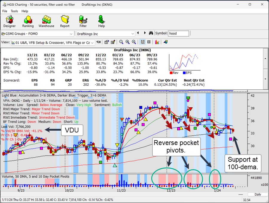
Lately I have noticed some interesting action in online gambling concern DraftKings (DKNG). We can observe the high-velocity rally it posted in the first half of November after it reported earnings on November 2nd. That rally flattened out in the latter part of November before the stock began rolling back to the downside in a three-waves-down tumble over the past month that has finally reached the left-side peak of the prior base structure and the 100-day exponential moving average (black). Volume dried up on Friday to -41.1% to define a VDU pullback to the 100-dema that could be bought using the 100-dema at 32.58 as a selling guide following Friday's 32.95 close.
This all comes after three waves of selling that are defined by three distinct groupings of reverse or downside pocket pivots. The first two groupings show heavy, above-average selling volume while the third shows volume drying up. On the first two of these reverse pocket pivots DKNG was testing the prior low, a test for supply that failed each time. On the third test, which is occurring now, volume is drying up. Meanwhile, a bullish VPA signal (magenta box) pops up on Thursday. This argues for a potential reversal off the 100-dema as sellers are finally washed out, at least near-term.
 On a more orthodox chart the action looks far, far less appetizing. However, it is possible to see the three-waves-down sell-off in DKNG off the late November peak and the current low-volume drift into the left-side peak of the prior base structure. To an orthodox chart reader this looks like a short-sale target where entries on the short side were available at the 20-dema this past Tuesday and again at the 10-dma on Friday. I would argue, however, that it was certainly a nicely profitable short on the early short-sale entry signals near the November highs, but now this is too obvious.
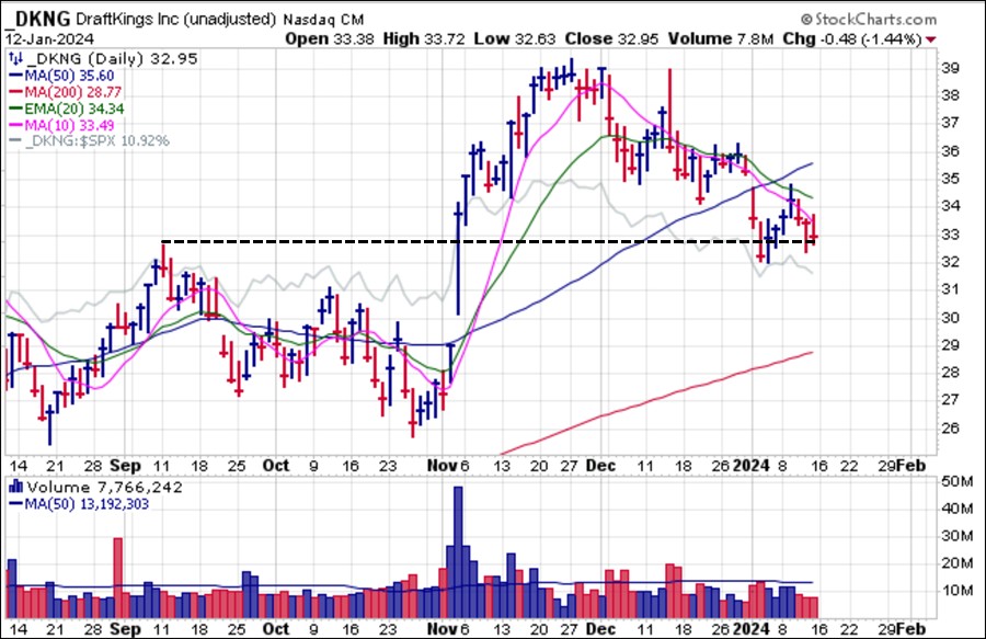 So while the orthodox daily bar chart shows a stock that looks like it is, for all intents and purposes, headed lower, the unorthodox VPA Chart View on top of it shows some bullish characteristics. Now we can watch this play out in real-time from here and discern whether the VPA Chart View offers an edge in this example in a process that I have been working through for some time as I use both types of charts to come up with similar or divergent conclusions and then see which ones tend to prevail in real-time. So, have a good time with this one, and maybe even think about going long DKNG while using the 100-dema as a tight selling guide within the context of any market upside this coming week.